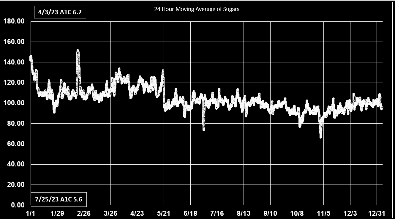
These charts Show the
24 hour Moving Average
of My Sugars.


  This website has no web ads because it has too few hits for Google ads to pay. k. So we need your donations to maintain this website and have these videos professionally made for tfbdiabets..com
THEY ARE NOT TAX DEDUCTIBLE
We APPPRECATE & THANK YOU!

        
    The charts below are for the 24-hour moving average of my sugar. Each dot is a 15-miute interval representing the average at that point in time for the last 24 hours.

    My 2019 charts show why the diabetic world should not consider lancing as a valid way of controlling a patient’s sugar. It shows how lancing tells an extremely poor picture compared to having a PAINLESS sensor on your compared to a complete picture with a sensor! Currently everyone is looking at individual sugar readings of a patient along with their A1C. Doctors who prescribe lancing say they should do it at waking and before each meal and bedtime. My guess is that the average diabetic does not like lancing their finger and so most only do it at most twice a day. How in world can the medical know what is really happening to a patient?
   
    Doctors have my permission to show patients theses charts when they think it is in the patients’ best interest to see what a better alternative is. I use the Libre FreeStyle 14 day. For patients, whose average sugar is over 150 they recommend the Libre FreeStyle 2 because it has an alarm that goes off at whatever the doctor recommends as too low. I say about because Libre support does not really know what it is. I tracked my low readings, and it went off a varus level of 59 to 64. I do not recommend the other major brand because it has readings every five minutes and cannot be tracked on a home computer. Besides, its sensors only lasts ten days and are more expensive. The combination and higher price make it 37% more expensive. When I looked at the frequently asked question list on their website their problems turned me off. Both make their charts in the cloud. Both of them have charts the show a graph based only on longer term averages. Neither of them can make the kind of charts that I make.

    I have made a change in the actual hours of the first chart on this page from covering the full 24 hours in a day to only daytime hours from 7 am to 11 pm. I already post-midnight to 7 am. Thes so that readers of this site can have a rue comparison of their sugar readings to mine. At the end of this year, I will post the complete year of 2023 in the hour format. All previous charts prior to 2023 will remain in the full 24-hour format.
Chart: 6 is for 2023 Current new hours.
Chart 6 is fpr Current 2024
Chart: 5 is for 2023
Chart: 4 is for 2022
 
Chart: 3 is for 2021
Chart: 2 is for 2020
Chart: 1 is for 2019
==============================
 
Chart: 6 is for Curren 2024t


hart: 5 is for 2023


4 is for 2022

 Chart: 3 is for 2021

Chart: 2 is for 2020

Chart: 1 is for 2019


Diabetes

My  Aveage Sugar
from 7:00 to 23:00

My Actual Sugar
from 7:00 to 23:00

My Average Sugar
from 23:00 to 7:00

Average of all My Sugarsr for Last 24 Hrs.

My Daily Sugar
Maximums & Minimums

Range of all My Sugas for Each Day by Itsels3

Midpoint of My Sugar
Half Above & Half Below

How Much My Sugar
Varies from the Average

My A1C  Lab Results

What is Brittle Diabete?

What Diabetes Did
to My Eyes

InsightsByT

About Me